Dragon Bridge development is going really well! As of this writing, we’ve got four days left on the Kickstarter, and during the time it’s been running I’ve gotten a ton of feedback about the layout, design, things like that. We’re still in the process of upgrading everything, but I have come across a bunch of lessons that may help other designers as they’re working on the physical or digital games.
Let’s take a look at a basic Dragon Bridge action card: 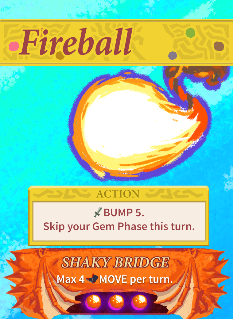
Even though there’s a lot about this game that’s unconventional rules-wise, I tried to stick to conventions as much as possible in terms of card design, because it’s kind of free information if you can do that. There are four sections of the card, as shown here:

The first section is the title of the card – nice and big and bold, and left-oriented so you can read it in a hand. Second section is also rather obvious: it’s the art (the artist usually fights with the game/graphic designers about how much real estate their art should get; in this case I’m all of those people, so I’m just always internally conflicted about it, but I think I have an OK balance here.) These are mostly fine and I won’t be discussing them much here, but if you have thoughts feel free to reply in the comments!
The third section is the Action section: this is really the “business part” of the card, and describes what the card does. We’ll get more into that in the next section. And finally, the fourth section is the Dragon Power, along with the Dragon Orbs below that. I will also dive into this part of the card, what it does, and how I’m improving it.
The Action Section
There’s always a question of “how much do you express things with symbols, and how much should there be text explicitly explaining everything”. Fireball is one of the simpler (and more powerful) cards, but some cards have you do rather complicated actions as well, like Shockwave (which is a much weaker BUMP, but which also makes the opponent discard a MOVE card or show their hand proving that they don’t have a MOVE card).
As you may know, you also have wizard powers and items that can modify the quantity of a BUMP or a MOVE, so if Fireball does 5 BUMP and you have an item that adds +2 BUMP, you can BUMP 7 with that Fireball. Seems simple enough.
One issue we ran into though was that our notation system was a little janky. Was “BUMP” – the word – the action, or the resource? It was a little weird to see “+2 BUMP” on a sword – does that mean I get the bump action again? Or two more times? These were a bit ambiguous.
Over the last week or so I’ve been updating this and with the help of my amazing playtesters over at our Discord, we came up with a new solution. Now, the keyword BUMP is the action, and you only see it when the action is being triggered. In addition to this, I made some updated icons that are more thematically appropriate for BUMP and
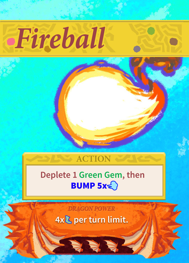
There are other changes to Fireball, like it now requires that you deplete a Green Gem to use it (part of bringing Green Gem use into more of a regular part of play, rather than just being item-fuel or “don’t die” fuel). But also you can now see how now not only have we replaced the old sword image (which suggests “damage” or physical combat) with the new wind gust, which to me is perfectly “push”-communicating while also being magical. Fireball has a huge Push amount – for cases like that, we’ll do it like “5x[icon]”. But in most cases, we can just show the icon, like this:

Bonuses can just use the icon like: “+[icon]” or “+[icon][icon]” for +2, and it’s no longer confusing what is the “bump resource” and what’s the “bump icon”. The blue color for both – seen nowhere else in the game – signifies that these are part of the same system. You might also notice that there’s another word there: Teleport. Teleport is basically the same thing as MOVE, but nothing (well, almost nothing) modifies it (it’s a way that we make sure Gem based movement doesn’t go wildly out of control).
The Dragon Box
You might also notice that the little circles on the bottom of the cards changed to wings. For awhile it had been suggested that we come up with a good icon that represents something that will make the Dragon fly. Originally, I wasn’t sure we could – the Dragon switching sides is kind of a specific and abstract thing, so I figured it staying abstract, just a little “circle” is probably fine. But the wings directly communicate that it’s not only related to the Dragon but also related to flying (when there are 7 of these icons down in the area you play cards to, the Dragon switches sides – it’s kinda a big deal in the game!). I think that does that pretty well.
If you go back to the first version of Fireball and look at its Dragon Power (a power the Dragon takes on when this is the card that causes the Dragon to switch sides; you put this card underneath the dragon with this part sticking out to indicate the new global rule), you can see that we also used to have a name for the specific Dragon power – SHAKY BRIDGE. Turns out that that was kind of a dumb waste of a ton of real estate, and it’s not really necessary for any reason. If players need to refer to it, they can just refer to it by what it does: the “gems cost 2 dragon power”, or the “+1 bump toward the Dragon” power, etc. It’s a much cleaner design and also makes the important text—the actual Dragon power—that much easier to read, which is important, because it’s not easy to pick up.
Readability
I played a game in real life (as opposed to on Tabletop Simulator) the other day at a friend’s place. He had kind of a low coffee table, a pretty different type of situation than I’m used to. And in that context, seeing something like your character power was quite hard! And you sort of “shouldn’t” (?) pick up your character card to read it, so it really was kind of a problem. With that in mind, I’ve been making readability in general a big priority; not just on the character cards but everywhere. I think it might’ve been Richard Garfield who said something along the lines of, “the rules to your game should really just confirm what the components already suggest”; the affordances should be strong everywhere. Dragon wings instead of orbs definitely help a lot in this regard, as well as being more visually distinctive compared with other icons (like teleport, or green gems, etc).
Anyway, that’s about it for now. As I said there’s only a few days left on the Kickstarter. If you’re interested, go take a look – it has already succeeded, so at this point you can grab a copy for just $9 with free shipping to the US.
Thanks for reading, and I hope you got something out of it!
You must be logged in to post a comment.